Our 12 days of installs has come to an end, and we finished it off with a major dining room redesign and an updated master bedroom project. Over the past month we have picked paint colors, installed wallpaper, and ordered furniture to pull these spaces together, and the transformation is absolutely amazing. Take a look at our project process and how the finished results turned out!
Dining Room
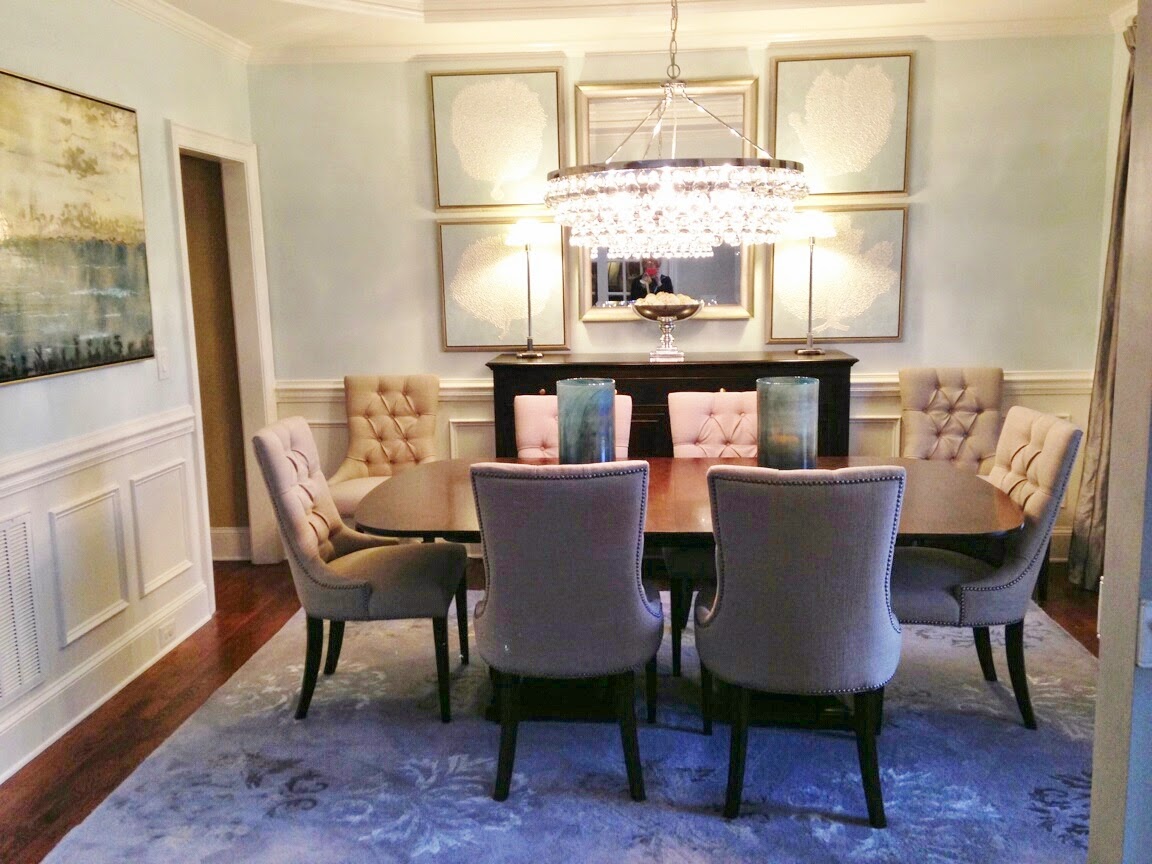
This room was a total redesign! it is the first space you see on your right as you enter into the house, so our client wanted an updated look that would be statement as guests entered their home. They also wanted it to function as the place where they would share their meals together on a daily basis instead of only using it for special occasions as they had previously done.
Here is what the space looked like BEFORE
Here is what the space looked like BEFORE
We started off by creating a floor plan and selecting furniture to fit the room.
A 3D rendering was created to give our client's a visual of what everything would look like once it was in the space.
A 3D rendering was created to give our client's a visual of what everything would look like once it was in the space.
Then the fun part began, INSTALL DAY! Here are a few snapshots of our team pulling everything together
Clearing the room for drapes and furniture to come in.
Melissa taking on the roll of our artwork installer for the day
The new buffet being placed in the room.
We also had a little visitor wanting to come in and help all day.
Here is the final result!
Here is the final result!
Master Bedroom
For this room our client just wanted to add a few new touches. So we selected a new paint color for the room and a wallpaper to use behind the bed to serve as a feature wall. New artwork, drapes, and bedding were added to pull everything together.
Here is what the space looked like BEFORE
Here is what the space looked like BEFORE
A mood board was created to see some of our selections come together.
Our seamstress Meghan prepping for the new drapes to be hung.

Melissa carefully positioning artwork.
The finished result!
The finished result!
Master Bath and Family Room
A fresh coat of paint was also added to the master bathroom to complete the updated look for the master suite.
Here is what the space looked like BEFORE
Frames were hung around the vanity mirrors to give them a finished look.
AFTER! The new pale blue colored walls make the room feel bigger and brighter.
The family room also got a little updating. Grass cloth wallpaper and accessories were added to the builtins
Hope you all enjoyed our 12 days of installs. Stay tuned to see what we have in store for both New South Design and New South Home Couture in the upcoming year!


.JPG)
.JPG)


.JPG)
.JPG)


I love this blog!!
ReplyDeleteI love this blog!!
ReplyDelete