RED
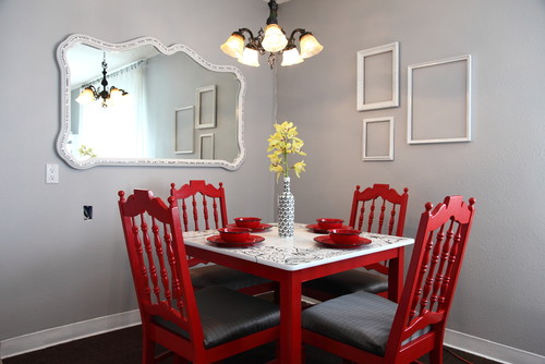
The color red is know to stimulate appetite and conversations, hence why we have seen this color featured in so many dining rooms. Red as a fashion statement has not been around since the '80's (remember the red lipstick and nail polish that our mothers wore?), but it's making a resurgence in rusty and coral tones and velvety purples. Robert Allen for Calico Corners just debuted their "Scarlet Collection" which, you guessed it, features all shades of red. Dramatic ways to feature this reborn color is shown by having one strong statement in red surrounded by neutrals or white.
BLUE
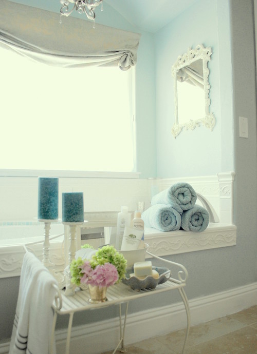
The whole "Green" movement has given new life to the color blue with the recent focus on preserving our oceans. The new term "Blue Economy" refers to the concept of aligning current production schemes and securing materials similar to how nature does in order to improve natural ecosystems and the quality of life. Also the refocus on American-made products and reduction of the American workforce has led to nostalgia of the American laborer of the past in denim blues. Watery blues and darker denim hues will be prevalent based on these two new movements. House Beautiful just dedicated an entire issue showcasing 350 ways to decorate in Blue with fresh and inviting spaces in this classic hue.
GREEN
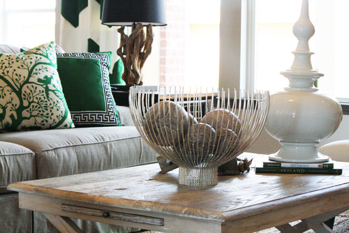
The "Green" movement has been picking up momentum as does the color itself. All shades of green were on the Fall fashion runways from olives to teals to emeralds. The teals will continue to remain important in interior design, but with less of a muted feel and brighter than in recent years. There is a movement away from the yellowy greens of past (how many of you have a sage something from Pottery Barn? Me!) and into the rich Emerald greens. As the color and the movement pick up speed, you'll see more of those miniature terrariums as home accents, which achieves the essence of both the color and the movement!
NEUTRALS

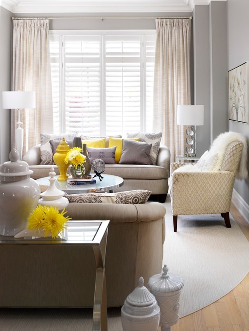
contemporary living room design by toronto interior designer Jennifer Brouwer (Jennifer Brouwer Design)
Neutrals are taking more of a backseat in 2012 versus recent years, but all good designers know that you will always need them - it's just a matter of reinventing them to make these base colors seem fresh! The cool grey neutrals that recently gained popularity are still important, but now are being paired with warm golds for that fresh look. Linen is still a key fabric as part of this story, but with pops of gold popping up more and more in recent months. A great way to update a neutral color palette is to add fun gold or yellow accents to your decor as shown in the picture above!
Source: Sherwin-Williams "Colormix 2012" - November 9, 2011


Hi Melissa! Love this post!
ReplyDelete