Showing posts with label 2012 Trends. Show all posts

Monday, September 3, 2012

STRIPES! Horizontal, that is......

Happy Labor Day everyone!  I have had a busy summer of travel and spending some quality time with my two-year old.  I am happy to report that preschool is back in session tomorrow, which gives me extra time to keep my blog updated with new ideas!

On our way home from a weekend trip to Charleston this AM, I was catching up on my some of my favorite home decor publications (Southern Living, Traditional Home, House Beautiful, and Martha Stewart Living).  I managed to earmark many pages of ideas, but the overwhelming theme that I kept coming across was horizontal striped drapery panels.  I absolutely fell in love with the drapes pictured below, and am trying to figure out a room in my house to incorporate this idea in!

From September 2012 issue of "Traditional Home"

For years, I have always preferred the idea of turning stripes "on their side" for drapery panels - vertical stripes get lost in the folds and you completely hide half of the pattern by doing this.  The image above shows wide, almost color-blocked, stripes as a bold modern statement in a neutral room.

My dining room, an ongoing project since October 2007!

I had my seamstress turn my more traditional vertical striped fabric on the horizontal for my dining room drapes (above) to bring a little more modern twist on the formal dining room.  Paired with the vertical stripes on the walls, it provides a nice contrast and also allows you to see all of the colors and patterns in the stripes on the fabric.

From Pinterest - Jane Molster Designs out of Richmond, VA

I found this picture a little over a month ago on Pinterest (follow me at pinterest.com/newsouthdesign) and I adored the orange and cream striped drapes featured here.  This designer out of Richmond, Virginia, (my birthplace!) definitely has a similar sense of style to and I love her use of pattern and stripes here.  Based on the amount of repins this picture got, it's definitely a favorite among others, too!

From July/August 2012 issue of "Traditional Home"

The home above in East Hampton, NY, featured a beautiful palette of watery blues and neutrals, and this was the first time that I had seen thin stripes "on the horizontal".  It is definitely has a casual appeal, and again, gives you the opportunity to see all of the colored stripes in the pattern.  The stripes create a nice compliment to the diamond textured rug and medallion pillows without overpowering the room.

Striped candles from www.fivestripes.com, as featured in "House Beautiful"

The other fun striped items that I came across in my magazine reading today were these cool striped candles.  Adding the big wide stripes to the classic taper candles gives them a little attitude, but would work with any decor.  You can find a wide selection of them at www.fivestripes.com, along with striped totes, pillows, and other home decor items.  Happy stripe hunting! 

Tuesday, April 24, 2012

High Point Furniture Market - Spring 2012

I made my first trip as an interior designer to the High Point Furniture Market this past weekend and was blown away by the amount of people and furniture I saw in just 2 days.  My most pleasant surprise, however, was how many designer-friendly resources are out there.  My vendor list has grown significantly since my return!

I was fortunate enough to travel with a friend and fellow interior designer, Jenny Van Stone, who was a great help to me.  We started the trip with our Charlotte chapter of the Interior Design Society at a tour of the Hickory Chair showroom where we met Alexa Hampton, Thomas O'Brien, and Suzanne Kasler in person.  I now have a personalized and autographed copy of one of Alexa's design books for bragging rights in my office!

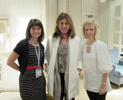
Meeting designer Suzanne Kasler with my friend Jenny at Hickory Chair

We also made the rounds at Hickory White, Lillian August, Drexel Heritage, Stanley Furniture, and many other furniture, lighting, and accessory resources that had great new collections and items to show off the latest trends.  Here is a quick rundown of trends that I saw throughout the market from higher priced showrooms to less expensive lines.

NAILHEAD DETAILS
Adding a nailhead trim to upholstered furniture has been a prevalent detail for a few years, but it now seems to have creeped onto casegoods and accessories, too.  The feeling out there is the more nailheads, the better.  An interesting fact that I learned this trip was that nailhead trim was used in the 18th and 19th centuries to reflect candlelight so that it was easier to see lines of furniture across a room before there was electricity.  It just goes to show that most timeless details like these all had more function when they were developed than just looking pretty.


Linen upholstered cabinets with nailhead trim at Hickory Chair

Nailhead trimmed mirrors at Hickory Chair

Leather upholstered sideboard with nailhead trim at Hickory White
 
Velvet upholstered bookcases from Thomas O'Brien's collection at Hickory Chair

Nailhead trim on wood at much less expensive Stein World
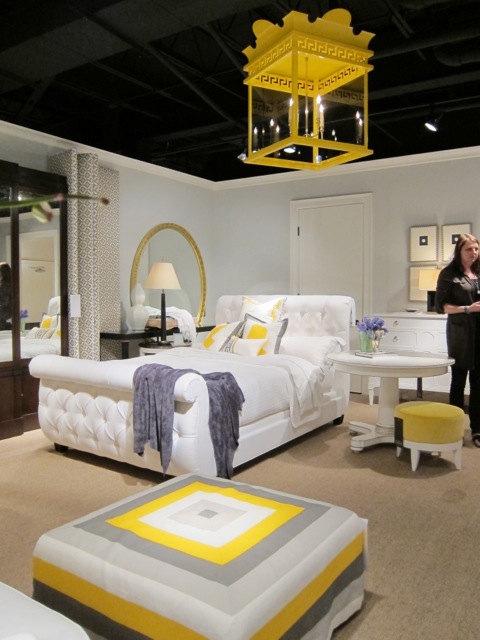
VIBRANT COLOR
Based on what I saw at Market, my 2012 Color Forecast was right on the money for what colors were going to be showing up in home decor this year.  Turquoise, kelly green, lime green, yellow, and grey were all throughout the showrooms in very unapologetic statements.  As much as I loved the yellow velvet with grey welted sofa that I saw in Drexel Heritage, I envy their ability to change it out next season with the latest color trend that awaits.  The best and least expensive ways to bring these colors into your home is through accessories and paint.  It's easy to freshen up a room by adding new pillows, curtains, brightly colored ceramic jars, or even a boldly painted accent wall that brings in the latest colors for you to enjoy.

A great way to update the color taupe is by adding grey and a pop of color as show here at Hickory Chair
 
More yellow and turquoise at Lillian August

Yellow and teal done farmhouse style at Bramble

It doesn't get much bolder than that bright yellow latern at Hickory Chair

Grey silk drapes on grey walls with chartreuse greek key trim at Hickory Chair

Lime green and turqoise go "cottage chic" at Bramble

THE COLOR INDIGO
I am writing a separate section on this one color alone based on what I feel is going to be the most prevalent and relavent color going forward.  It made it's appearance paired with gold, cobalt blue, and red in the Hickory Chair showroom and is the one and only color featured in Restoration Hardware Spring 2012's catalog.  For those of you that were resisting the grey washed furniture and lack of color that Restoration Hardware has been touting for the past couple of years (I was!), the entire marketplace was filled with that look.  Indigo is a fresh way to compliment this neutral and "washed-out" trend that will be flooding all home furnishing stores very soon, if not already.

Hickory Chair combining indigo, cobalt, gold, and red for a fresh color statement


Ikat in indigo on a custom bench at Hickory Chair

An indigo sofa in a tie-dye, almost python, print at Hickory Chair

Restoration Hardware using indigo as an accent to their very neutral look

THAT NEUTRAL LOOK
If you haven't gotten on the mailing list for Restoration Hardware's catalog or checked it out online, I suggest doing so.  They were the first of the chain retail stores to jump on this neutral, "Parisian flea market" look a few years ago and it has definitely caught on.  Every showroom had a collection with white-washed or grey-washed furniture, linen upholstery, and wine barrel or "birdcage" lighting.  I will definitely be following their newest additions closely, and am very curious to see if this "Deconstructed Collection" that they just introduced will be showing up in other furniture showrooms in the next year or two.

As much as I disliked this neutral trend when it first came out, I have actually grown to like it and am trying to figure out how to incorporate it without completely changing the look of my entire house.  Hence why I am such a fan of incorporating the color indigo (and possibly gold or red as Hickory chair did) with this - it allows you to bring in pieces of this neutral look, versus replacing everything and eliminating color completely from your home.

I didn't take any pictures of this look since it has been around for a few years, but I feel that you can get the best sense of it by perusing Restoration Hardware's website or catalog.  The good news is that you will be finding it at a more affordable retailer near you very soon!


Thursday, March 15, 2012

Up and Coming Color Story: Orange and Blue

I have gotten so much positive feedback from the orange and blue nursery that I just completed that this color scheme has really been on my mind lately.  I first saw it last Fall in the March of Dimes show house in Myers Park and both my client and I loved it when we saw it. 

Orange and teal tray from March of Dimes show house in Charlotte, NC
Well, I walked into a well-known fabric store this morning and was pleased to find a fabulous display of this new eye-catching color combo.

Up and coming color story: orange and blue


As the sales associate said, it's really just starting to show up, so right now it's hard to find fabrics with this combination, but I suspect that more and more will be popping up soon.  Here's a sneak peak of some of the fun fabrics I have found in the past 6 months in these colors.  The last one will be worked into my current orange and brown home office.  I think that adding the blue will give the space the fresh "pop" that it needs!

Interesting way to do stripes on a square ottoman or pillow
Orange and light teal paisley

Orange and light teal moroccan print

I'm excited about adding this to my current orange and brown home office!


Thursday, November 10, 2011

Color Forecast 2012

Whites and neutrals have been an overwhelming theme in interior design in the past couple of years, but I'm here to tell you.....COLOR is back!  I don't know about you, but I'm breathing a sigh of relief - the thought of a white sofa, my toddler, and my dog just don't mix!  Below is a Sherwin-Williams' color wheel and descriptions of the four color families that will be making an impact in home design in 2012.

RED
The Upward Bound House by Kelly LaPlante eclectic dining room

The color red is know to stimulate appetite and conversations, hence why we have seen this color featured in so many dining rooms.  Red as a fashion statement has not been around since the '80's (remember the red lipstick and nail polish that our mothers wore?), but it's making a resurgence in rusty and coral tones and velvety purples.  Robert Allen for Calico Corners just debuted their "Scarlet Collection" which, you guessed it, features all shades of red.  Dramatic ways to feature this reborn color is shown by having one strong statement in red surrounded by neutrals or white.

BLUE
Centsational girl traditional bathroom

The whole "Green" movement has given new life to the color blue with the recent focus on preserving our oceans. The new term "Blue Economy" refers to the concept of aligning current production schemes and securing materials similar to how nature does in order to improve natural ecosystems and the quality of life.  Also the refocus on American-made products and reduction of the American workforce has led to nostalgia of the American laborer of the past in denim blues.  Watery blues and darker denim hues will be prevalent based on these two new movements.  House Beautiful just dedicated an entire issue showcasing 350 ways to decorate in Blue with fresh and inviting spaces in this classic hue.


GREEN
Family Room contemporary family room

The "Green" movement has been picking up momentum as does the color itself.  All shades of green were on the Fall fashion runways from olives to teals to emeralds.  The teals will continue to remain important in interior design, but with less of a muted feel and brighter than in recent years.  There is a movement away from the yellowy greens of past (how many of you have a sage something from Pottery Barn?  Me!) and into the rich Emerald greens.  As the color and the movement pick up speed, you'll see more of those miniature terrariums as home accents, which achieves the essence of both the color and the movement!

NEUTRALS
Decor by Jennifer Inc contemporary living room

Neutrals are taking more of a backseat in 2012 versus recent years, but all good designers know that you will always need them - it's just a matter of reinventing them to make these base colors seem fresh!  The cool grey neutrals that recently gained popularity are still important, but now are being paired with warm golds for that fresh look.  Linen is still a key fabric as part of this story, but with pops of gold popping up more and more in recent months.  A great way to update a neutral color palette is to add fun gold or yellow accents to your decor as shown in the picture above!


Source:  Sherwin-Williams "Colormix 2012" - November 9, 2011